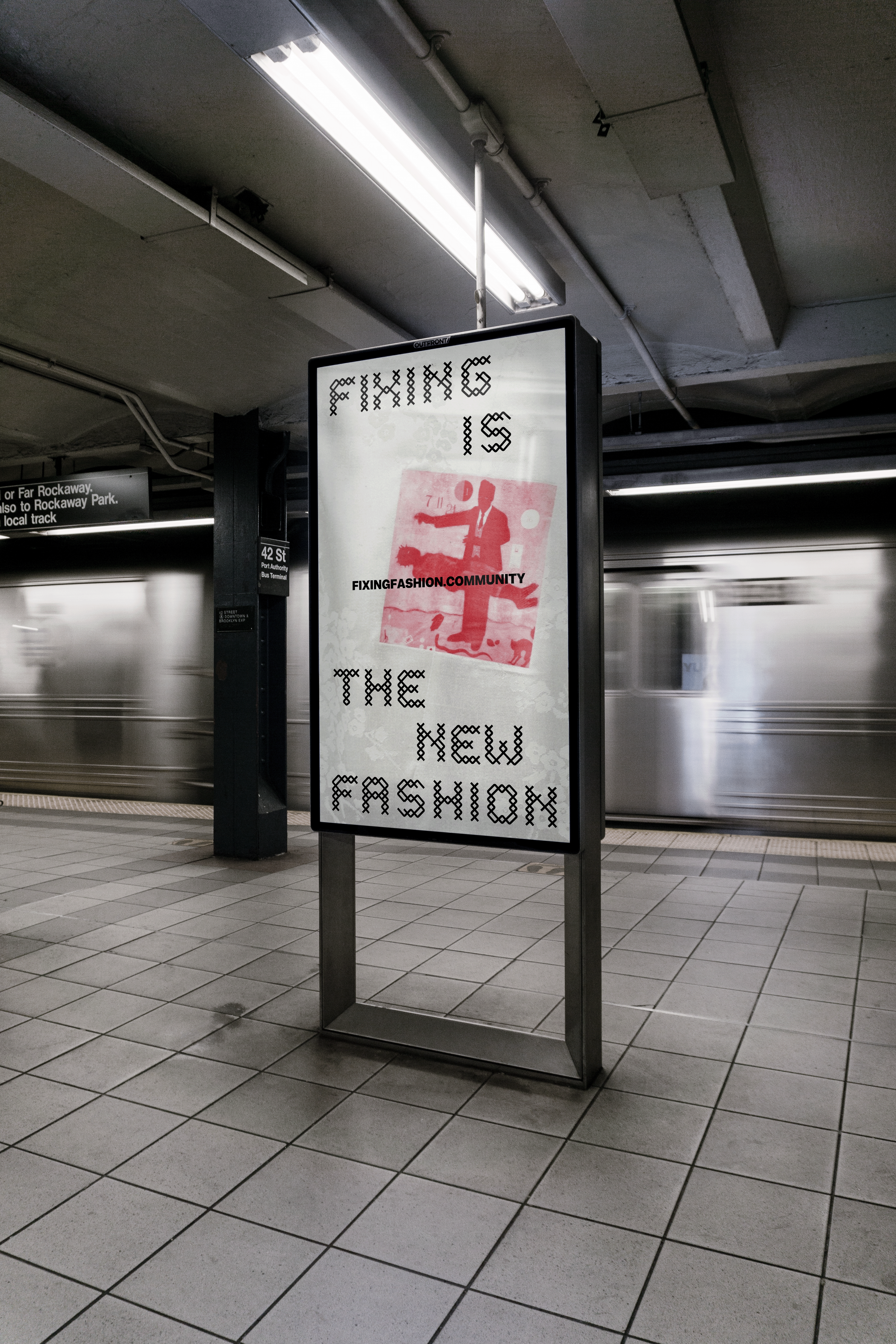
Fixing Fashion is a design hub based in New York that encourages creative communities to share ideas around upcycling and sustainable design. The project aims to position mending and repair not just as a necessity, but as a celebrated fashion trend.
Ecovative is a biotechnology company that develops high-performance, environmentally friendly alternatives using mycelium.
The visual identity redesign is inspired by the organic structure of fungi, reinforcing the brand’s commitment to a regenerative future.
REVERSE
GRAPHIC DESIGN CREATIVE FASHIONAND MORE
Yunyi Tiffany He is a multidisciplinary designer specializing in branding, creative coding, and fashion innovation. Originally from Beijing and based in New York, she recently graduated from the School of Visual Arts and will pursue her MPS in Fashion Management at Parsons.
New York Local Time:
Beijing Local Time:
PROFESSIONAL EXPERIENCE
iMpact(美讯)
Intern, Marketing Department
Jennifer SitinasCreative assistant
Harper’s Bazaar Art China
Visual Editor, New Media Department
05/2024 - 07/2024New York, USA
05/2024 - 08/2024New York, USA
06/2023 -09/ 2023Beijing, China
01 FIXING FASHION
Brand Identity
Fixing Fashion is a design hub based in New York that encourages creative communities to share ideas around upcycling and sustainable design. The project aims to position mending and repair not just as a necessity, but as a celebrated fashion trend.
02 ECOVATIVE
Brand Identity
Ecovative is a biotechnology company that develops high-performance, environmentally friendly alternatives using mycelium. The visual identity redesign is inspired by the organic structure of fungi, reinforcing the brand’s commitment to a regenerative future.
ms;
Custom Logotype
The logo integrates the letter E with the silhouette of mushrooms, and the logotype with mixed case is built upon that.
A pattern is inspired by the growing stages of mycelium:
1. Seed 2. Grow 3. Reproduction 4. System
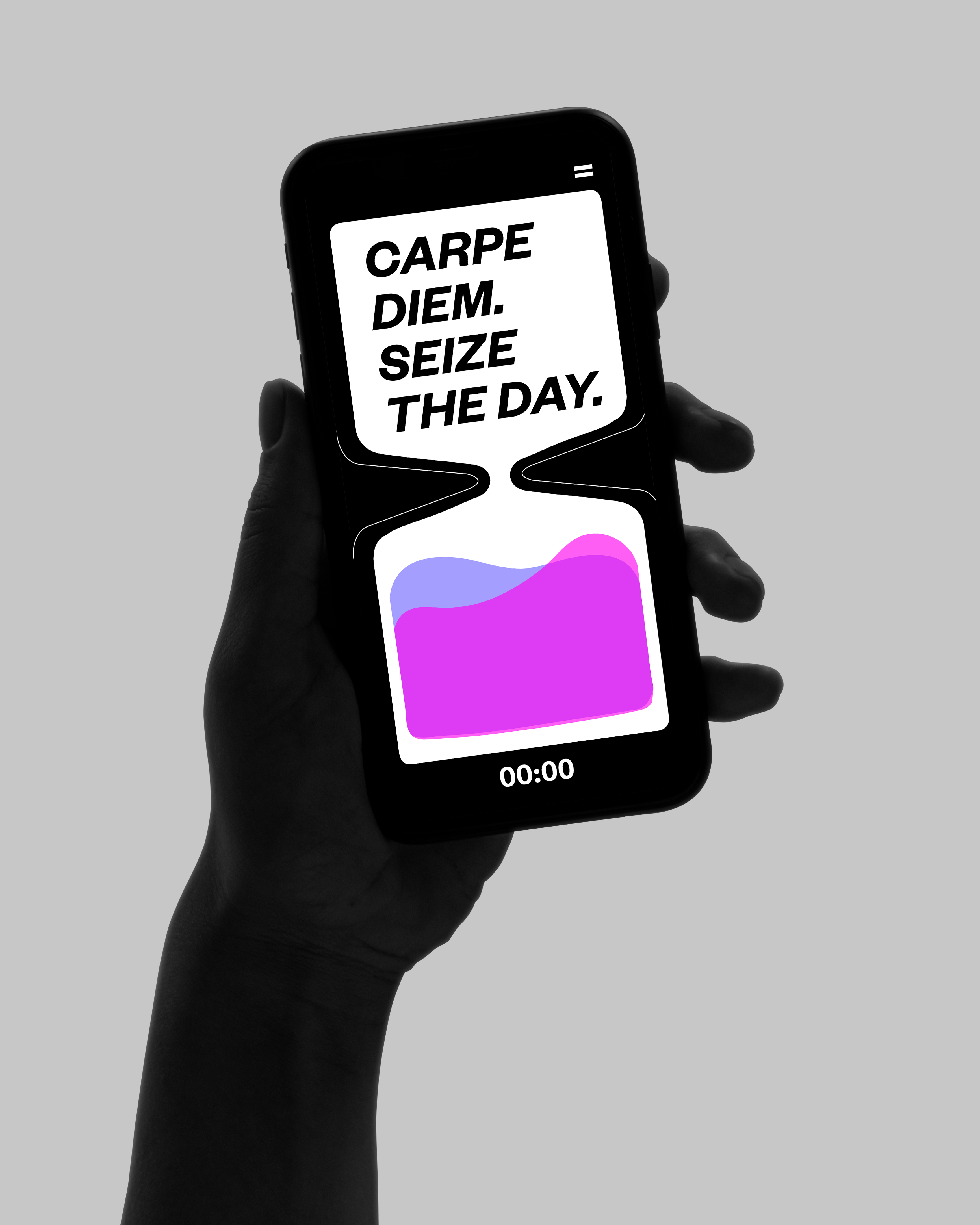
04 REVERSE
Application Design
Reverse is a time-reclaiming app designed as a digital hourglass. Users can activate it instantly by flipping their phone, initiating a focused countdown. As time flows, a curated quote about time, drawn from literature or film, gradually appears, offering reflection and encouragement throughout the session.
z
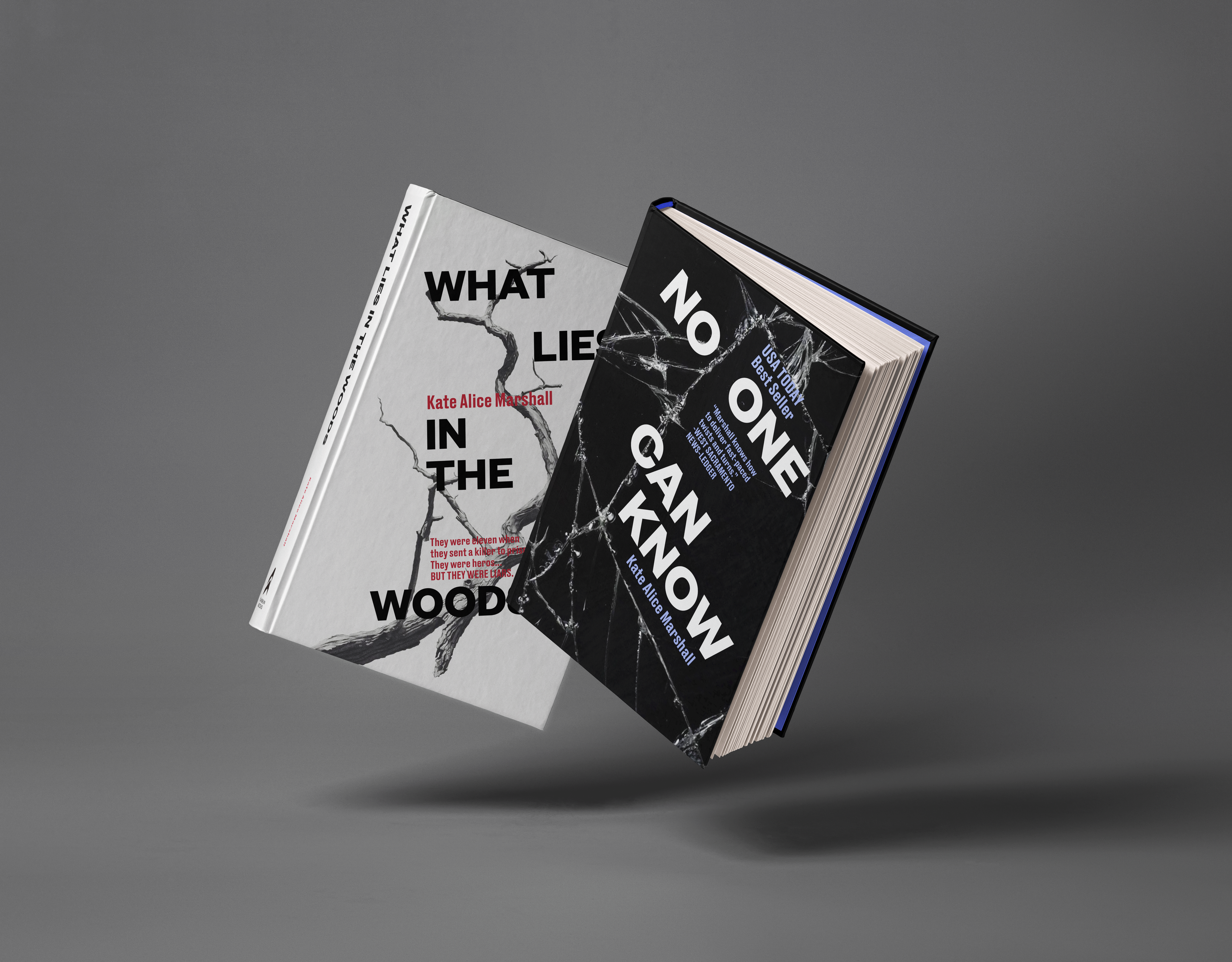
06 FLATIRON BOOK
Brand Identity and Editorial System
The visual identity of Flatiron Book Publishing House was redesigned to align with the pace of the modern world. The bold, iconic sharpness of the Flatiron Building inspired key design elements, reflecting the brand’s forward-thinking spirit. For the editorial system, the building’s distinctive 22-degree angle was translated into diagonal structures and grid systems, creating a cohesive and dynamic visual language.
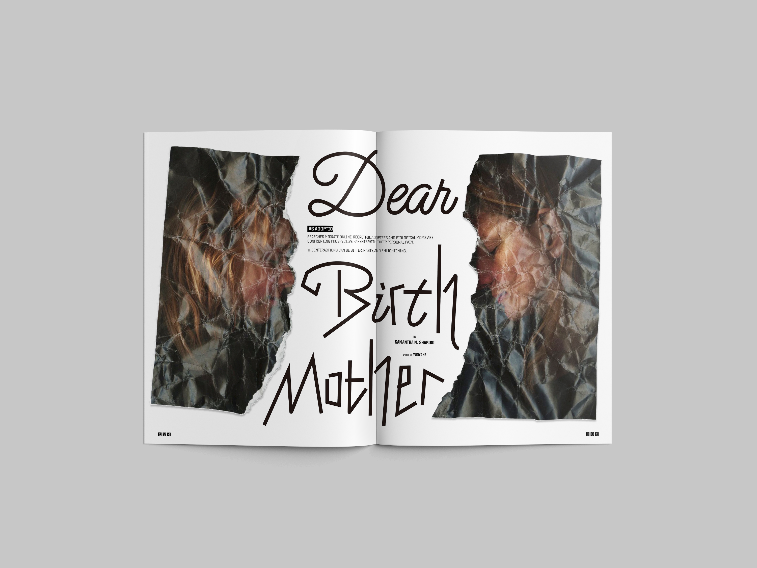
08 DEAR BIRTH MOTHER
Long Form Editorial Redesign
Dear Birth Mother is an article originally published in Wired magazine, documenting the emotional journey of a couple navigating the adoption process. The redesign uses a bespoke headline typeface and manipulated imagery to visually express the psychological breakdowns and emotional turbulence experienced by the main characters throughout the story.